All Of Those TVC Updates And Improvements: "What A Coincidence!"
We couldn’t help but notice a few trends with regards to The Vintage Collection. We’ll just say, “What a coincidence!” (more….)

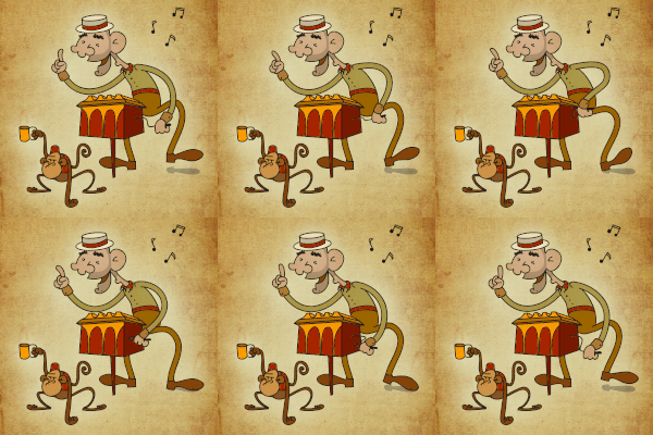
You’ll have to guess who the monkey and the organ grinder are.
There have been quite a few updates in The Vintage Collection. Many notable changes seem to have begun with “whining” right here at JTA. Here are just a couple of examples.

From 2013 through April 2017, Jedi Temple Archives was the loudest proponent for The Vintage Collection’s return. We ere so loud about it that we were accused of beating a dead horse, among many other things. Yes, it’s true. We couldn’t accept that TVC was gone as “forever,” but it made us champion harder for its return. Undeterred, JTA posted weekly articles trying to “shame” Hasbro into getting TVC back. We tortured thw Hasbro team and various media gatherings. But when its return finally became a reality in 2017 when officially announced at Star Wars Celebration, the labor pains paid off. Hasbro even acknowledged our influence in the announcement. “”Is Paul Harrison still conscious?” Those words were uttered by Hasbro after they announced the return of The Vintage Collection for Spring 2018. After thunderous applause, I started the standing ovation.” See more HERE and HERE!
What a coincidence!
Extremely dissatisfied with Hasbro’s art department’s interpretation of the vintage Kenner card back art for the modern figures, JTA, along with the assistance of longtime and respected reader Binary_Son (who also made most of our brilliant Jabba’s Sail Barge advertisements, put together an article of how “off” Hasbro was from the card art of the classic Kenner figures, especially the “name pill.” For most who collect packaged The Vintage Collection figures, packaging aesthetics and accuracy are key. It’s part of The Vintage Collection experience. We begged Hasbro to pay attention to the wrong font they were utilizing, as well as the placement of the words and the lack of subtitles to describe the figures. We also brought to their attention the issue of the bubbles and figure placement and how it negatively impacts the aesthetics of the card backs. Well, the whining paid off because bubble sizes reduced, and most recently from The Rise Of Skywalker figures, we now know that Hasbro is finally using a large Avant Garde font of the original Kenner line. Too bad they can’t go back and fix the others! Click HERE for the full story.
What a coincidence!
JTA uttered from the start that The Vintage Collection needed to be an ongoing conversation, and we titled many of our headlines that way for each new topic discussed. Shortly thereafter, Steve Evans, former design director of Star Wars, began using The Vintage Conversation to express key items that needed to be addressed, from character selection, to specific card back art aesthetics. While some of our suggestions were ignored, many others were not (like restarting the line at VC116 for example). Click HERE for the full story.
What a coincidence!
We were horrified when Hasbro announced that they were repackaging an old and incorrect version of Darth Revan for The Vintage Collection. The 2007 30 (77-07) was fine for the time, but considering it for the 2019 line is egregious at best. We made a big stink about it and posted an article encouraging Hasbro to “shrink down” The Black Series [Phase III] 6” figure instead. We got a lot of criticism because people said they wanted the 2007 figure because they missed it. (We should reach higher, people.) You can read the comments, but we got a lot of heat for suggesting this. Well, Darth Revan disappeared from planned case assortments and as SDCC this year, they announced that an all-new figure was coming because of the blowback they received about the 2007 figure’s reissue. Click HERE for thr full story.
What a coincidence!
With all of this said and documented, is there anything else you’d like for us to bring to Hasbro’s attention?
Related Links
-Click HERE to return to the home page-


![Chewbacca - TBS [SW40] - Six Inch Figures Chewbacca - TBS [SW40] - Six Inch Figures](/galleries/2017/Review_ChewbaccaTBS6SW40/thumbnails/Review_ChewbaccaTBS6SW40019.jpg)